Global partnerships
Co-creating with industry leaders
Each market required close collaboration with lending partners to shape user experiences that balanced brand consistency, regulatory compliance, and local user expectations.


As the lead designer on TikTok PayLater, I drove the end-to-end product experience across Southeast Asia, the United States, Europe, and Latin America — a deeply complex financial product spanning three interconnected journeys: activation (KYC, onboarding, credit underwriting), payment (checkout, installment selection, disbursement), and post-purchase management (repayment, bill tracking, credit adjustments). I worked hand-in-hand with product and engineering to ship consumer financing at global scale, in partnership with Klarna, PayPal, Kredivo, and Atome.
TikTok PayLater is a consumer BNPL product embedded within TikTok Shop, enabling users to split purchases into installments. Each market required navigating unique regulatory frameworks, lending models, and user behaviors — often starting from near-zero with no existing design guidelines to follow.
Each market required close collaboration with lending partners to shape user experiences that balanced brand consistency, regulatory compliance, and local user expectations.
Unlike working deeply on a single feature, I shaped full user journeys across multiple regions — each with its own complexities in regulations, lending models, and cultural norms around financial products.
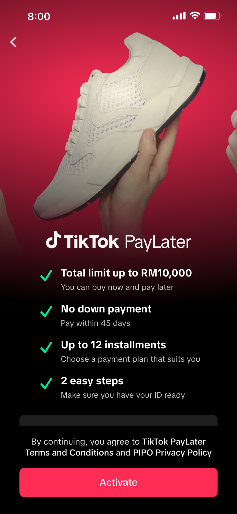
Thailand launched as a white-label partnership with Kredivo. Malaysia was the first self-operated TikTok PayLater in SEA — a major step-change in complexity with no lending partner, requiring full ownership of the financial product experience.
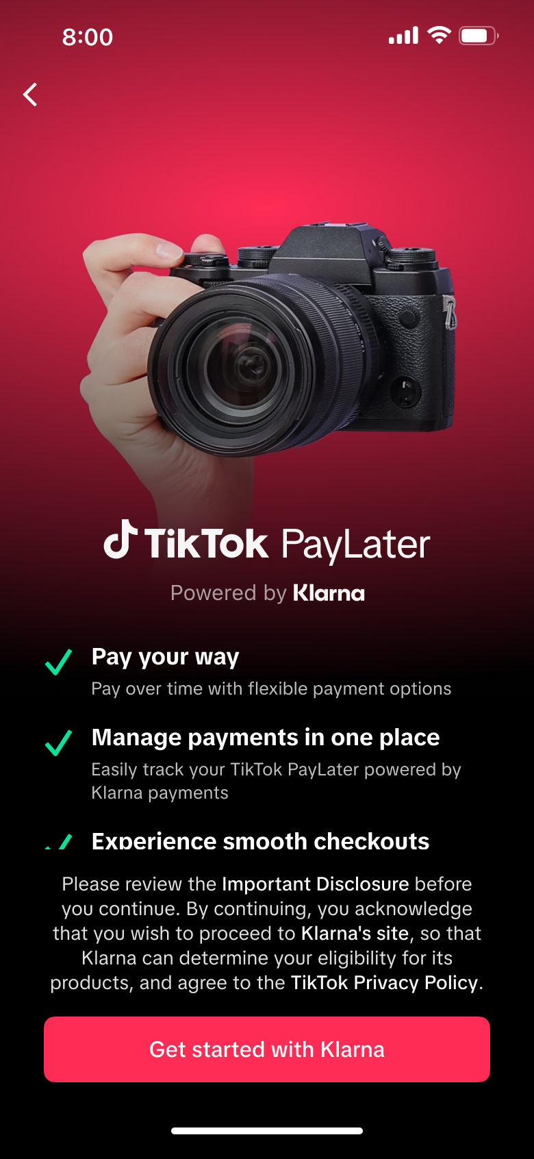
Designed a fully in-app BNPL experience in close partnership with Klarna — from MVP targeting existing Klarna users to full release with new user acquisition, purchasing power visibility, and auto-pay.
Extended the Klarna partnership into Europe across UK, Germany, France, Spain, and Italy — introducing flexible installment options including Pay in 30 and longer-term financing tailored to each market.
Designed the inaugural self-operated TikTok PayLater for Mexico, with Brazil to follow — navigating stricter regulatory requirements and conducting early concept testing with local users to validate directions before launch.
Each launch followed a structured yet flexible process — adapting to the unique regulatory, cultural, and partner dynamics of every market while maintaining a scalable global design foundation.
Deep-dived into local BNPL players like Shopee PayLater, Klarna, Kueski, and Mercado Pago to understand market standards, mental models, and user expectations.
Conducted early concept validation and on-site local testing to gather user feedback before launch — ensuring designs aligned with local behaviors and language expectations.
Worked closely with partner product and design teams across multiple regions — both in-person and remotely — to shape co-branded experiences and align on feasible, locally relevant solutions.
Adapted every touchpoint for regulatory compliance, lending model differences, and cultural nuance — from activation flows to repayment language and installment structures.
Led on-site UAT in every new market ahead of launch — heading the cross-functional team across product, engineering, QA, and risk to test directly with local users, surface critical issues, and ship fixes before going live.
Regulations, lending models, and cultural conventions varied wildly from region to region. Each launch surfaced design problems I hadn't solved before — and required rethinking flows that worked everywhere else.
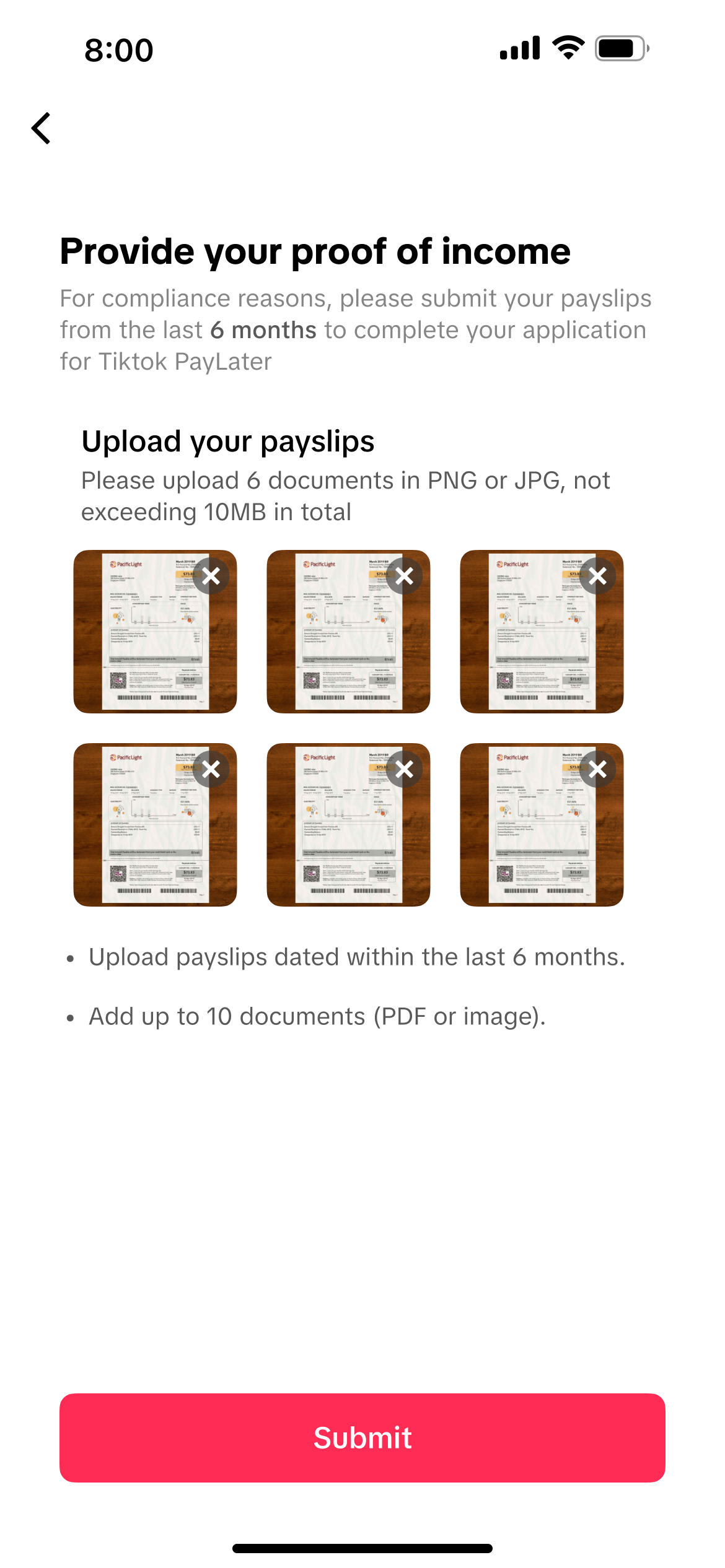
P-Loan regulations required users to upload six separate payslip documents during onboarding — directly conflicting with the TTPL principle of minimizing input to preserve activation conversion.
Solution Designed a guided, chunked submission flow with visual progress and clear per-document requirements — meeting compliance while keeping the experience feeling simple and low-friction.
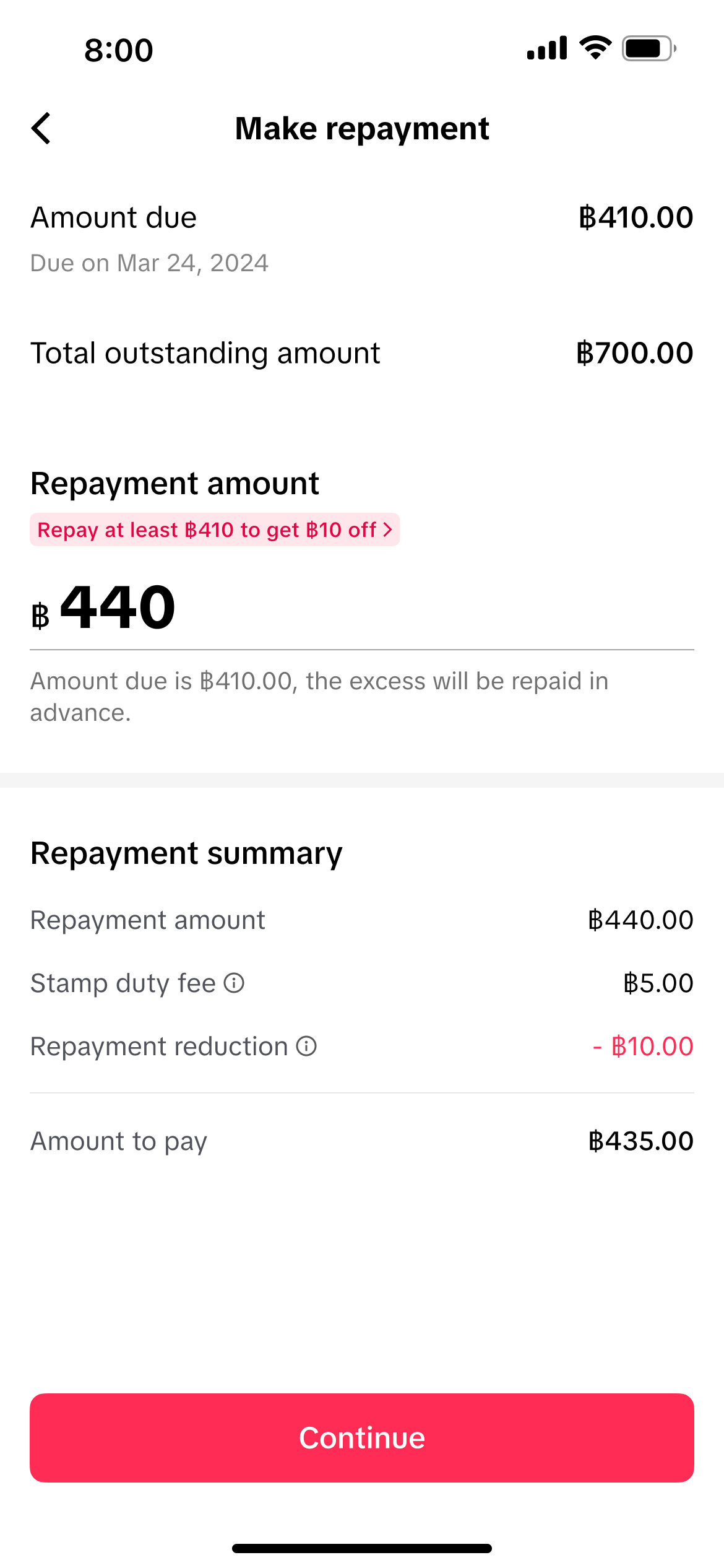
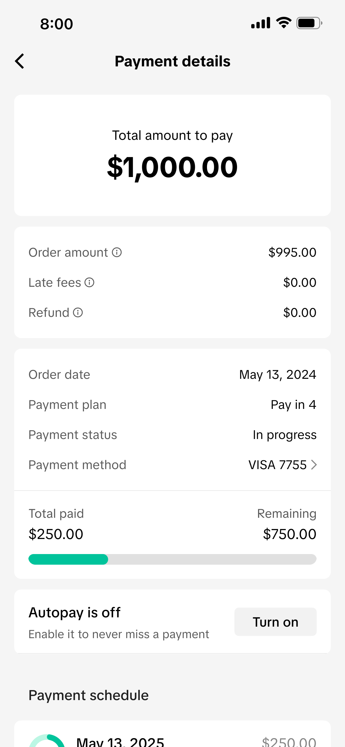
Regulation required lenders to charge a 0.05% stamp duty on the total contract amount. I had to find the right touchpoints during repayment to disclose this fee without confusing users or cluttering the UI.
Solution Integrated the fee into the repayment summary with an inline breakdown, balancing backend calculation constraints with UX clarity so users could see their total payable at a glance.
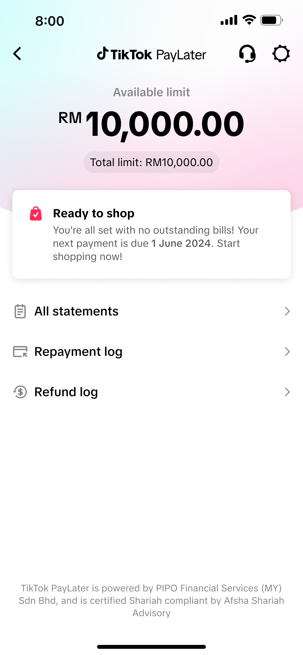
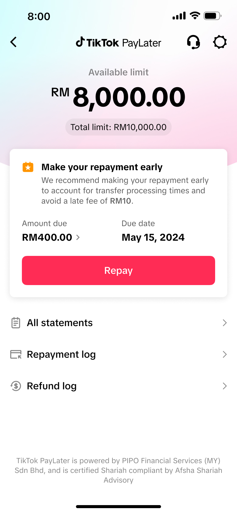
For SEA's first self-operated launch, legal guidance required removing the word "credit" from all copy and UI. The challenge: users still needed to immediately grasp that their spending limit resets as they repay — the core mental model that makes BNPL feel useful and trustworthy.
Solution Designed around the idea rather than the word. Through copy, hierarchy, and visual cues — available limit shown front and center, repayment reflected directly into a restoring limit, and clear language around what's spent versus what's available — users could understand their revolving limit at a glance, without ever needing the term itself.
The US product uses a non-revolving model — purchasing power is assessed per transaction with no fixed credit balance. The experience needed to clearly communicate dynamic purchasing power while setting realistic user expectations.
Solution Designed a new activation and post-purchase UI that surfaces purchasing power contextually per order — shifting the mental model away from visible credit balances toward per-transaction eligibility.
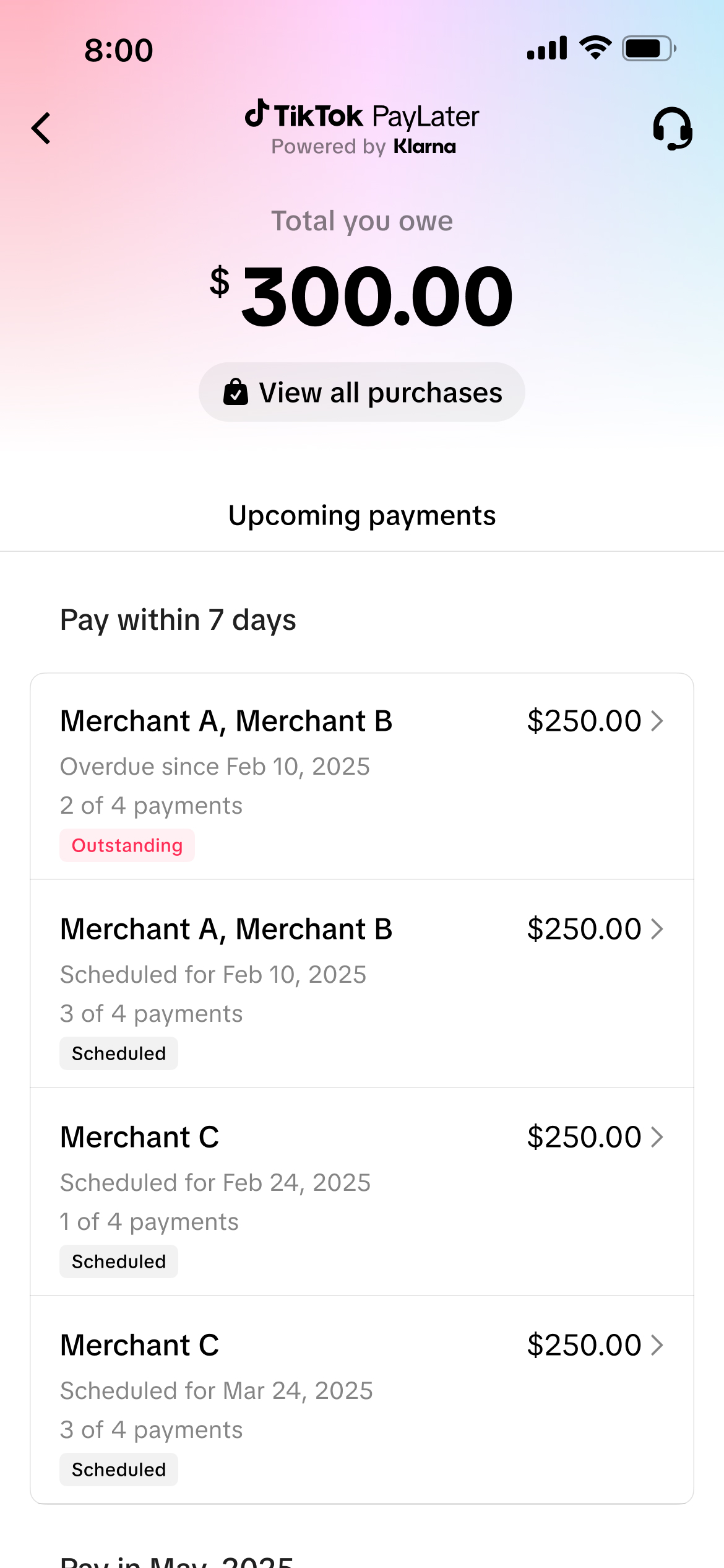
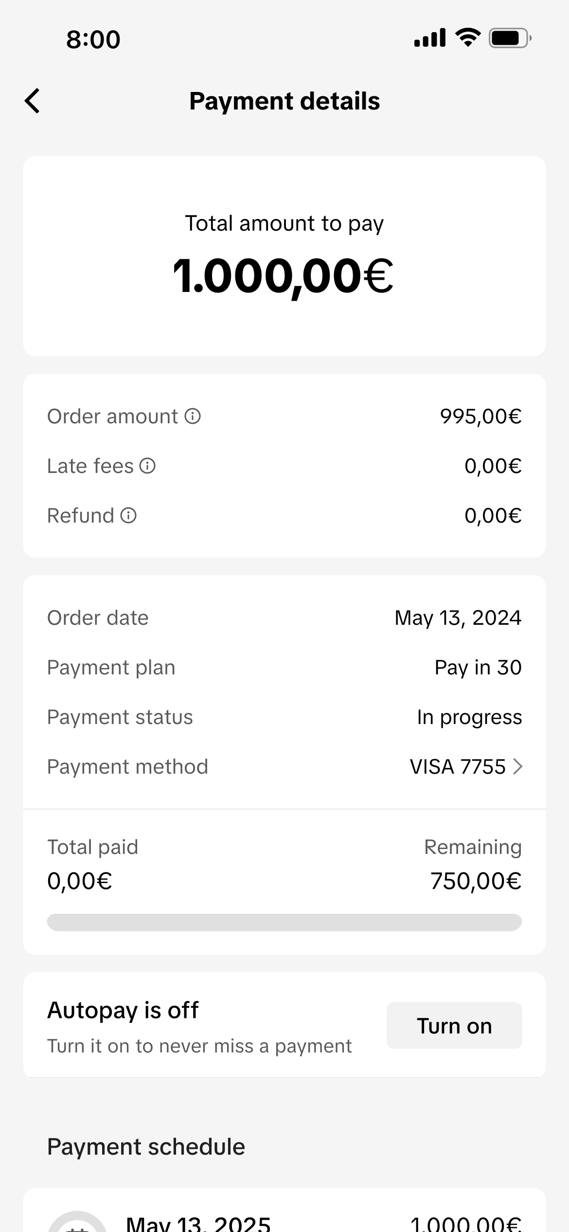
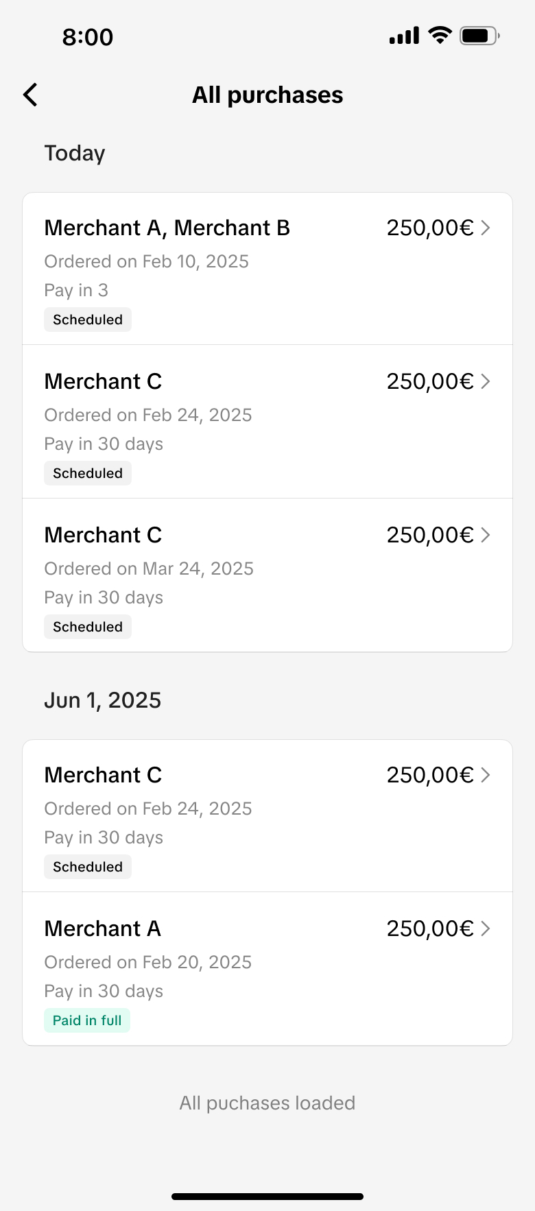
Unlike SEA's consolidated monthly bill, US installments follow an order-based structure — each purchase has its own schedule and due dates. This required a fundamentally different approach to payment tracking, reminders, and post-purchase management.
Solution Rebuilt the end-to-end journey around order-level repayment — surfacing per-order details, helping users manage concurrent schedules, and redesigning reminders to match the US installment model.
Different parts of the user journey were owned by separate teams at TikTok and Klarna — creating complexity across page ownership, transitions, and brand consistency. Users needed to always know which platform was collecting their information.
Solution Established shared design guidelines with Klarna's team and emphasized consistent navigation patterns — so users could move smoothly across pages without confusion or drop-off, always oriented to the platform they were on.
The EU launch needed to accommodate a new "Pay in 30" deferred plan alongside longer-term financing — without disrupting the established co-branded experience or creating confusion between plan types.
Solution Integrated the new plans as modular options within the existing payment framework — letting users clearly understand and select between plans while preserving consistency with the US co-branded design system.
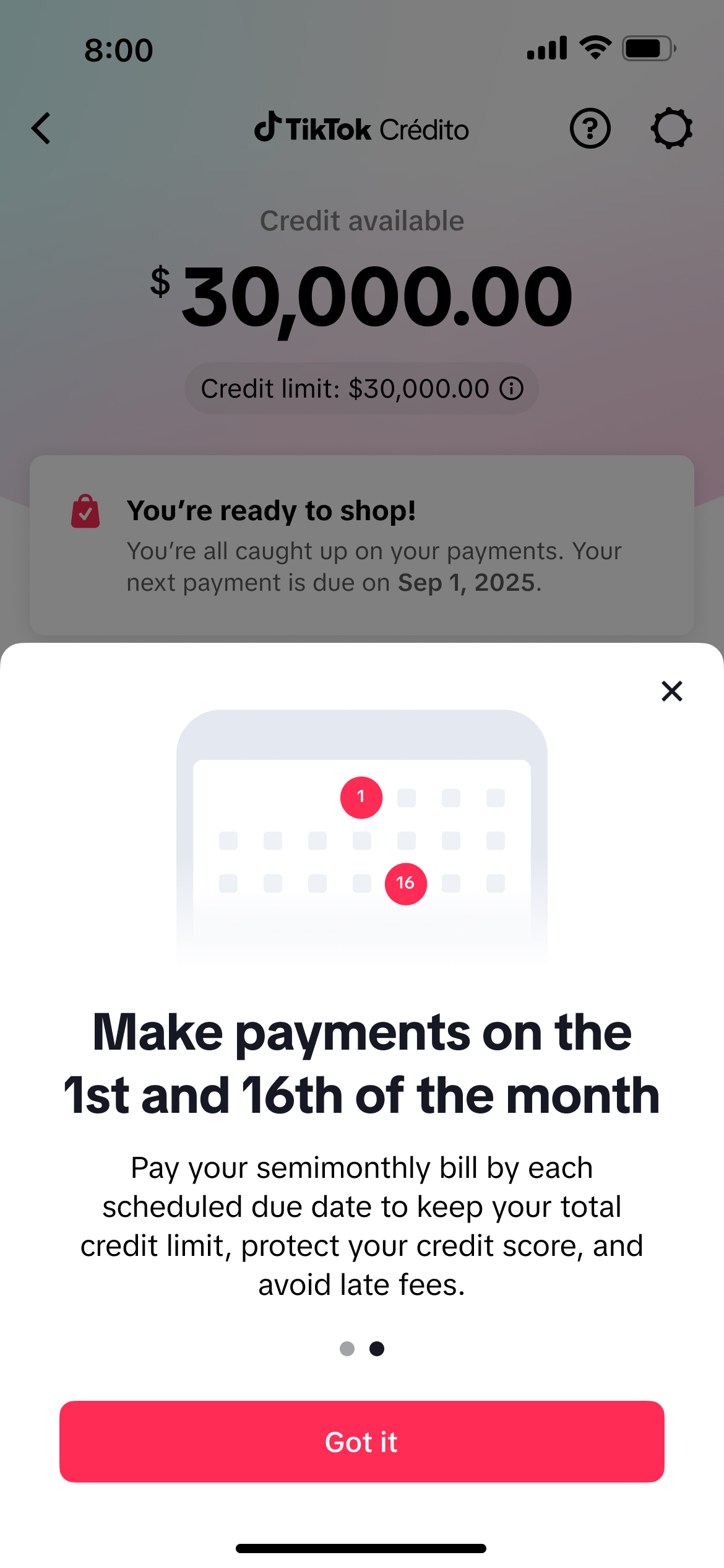
Mexico's shift from monthly to semi-monthly billing required users to make payments twice a month — a significant communication challenge. The design needed to clearly educate users on the new frequency while preserving existing monetary definitions.
Solution Reframed the billing experience around two clear payment dates (1st and 16th), with educational onboarding moments to set expectations and reduce confusion across the entire repayment journey.
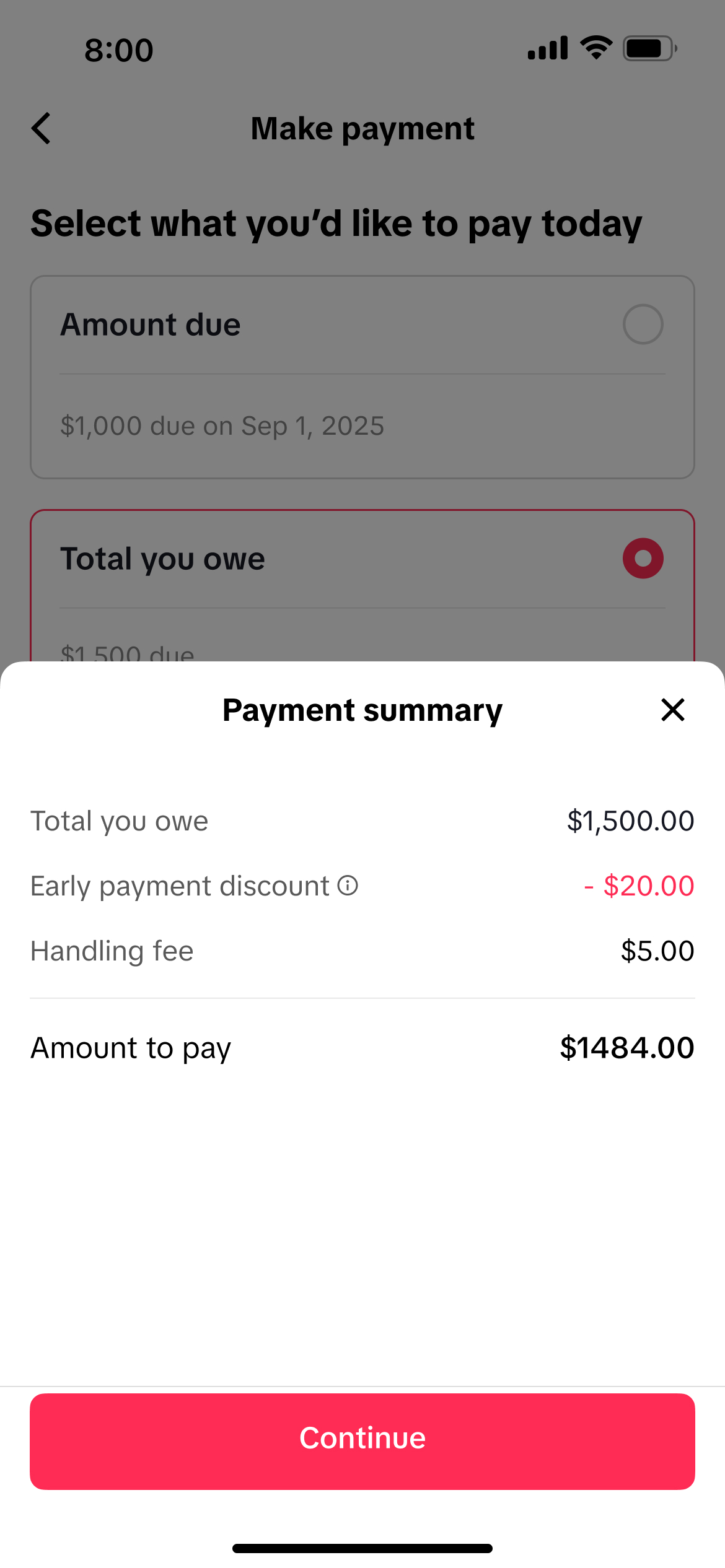
Users could only pay predefined amounts (amount due or total owed) — not custom values — which required clear communication of early payment discounts and fees without confusing users used to more flexible input.
Solution Designed a constrained payment selection UI with transparent fee breakdowns and early payment incentives surfaced clearly — setting expectations upfront and building trust in the repayment flow.
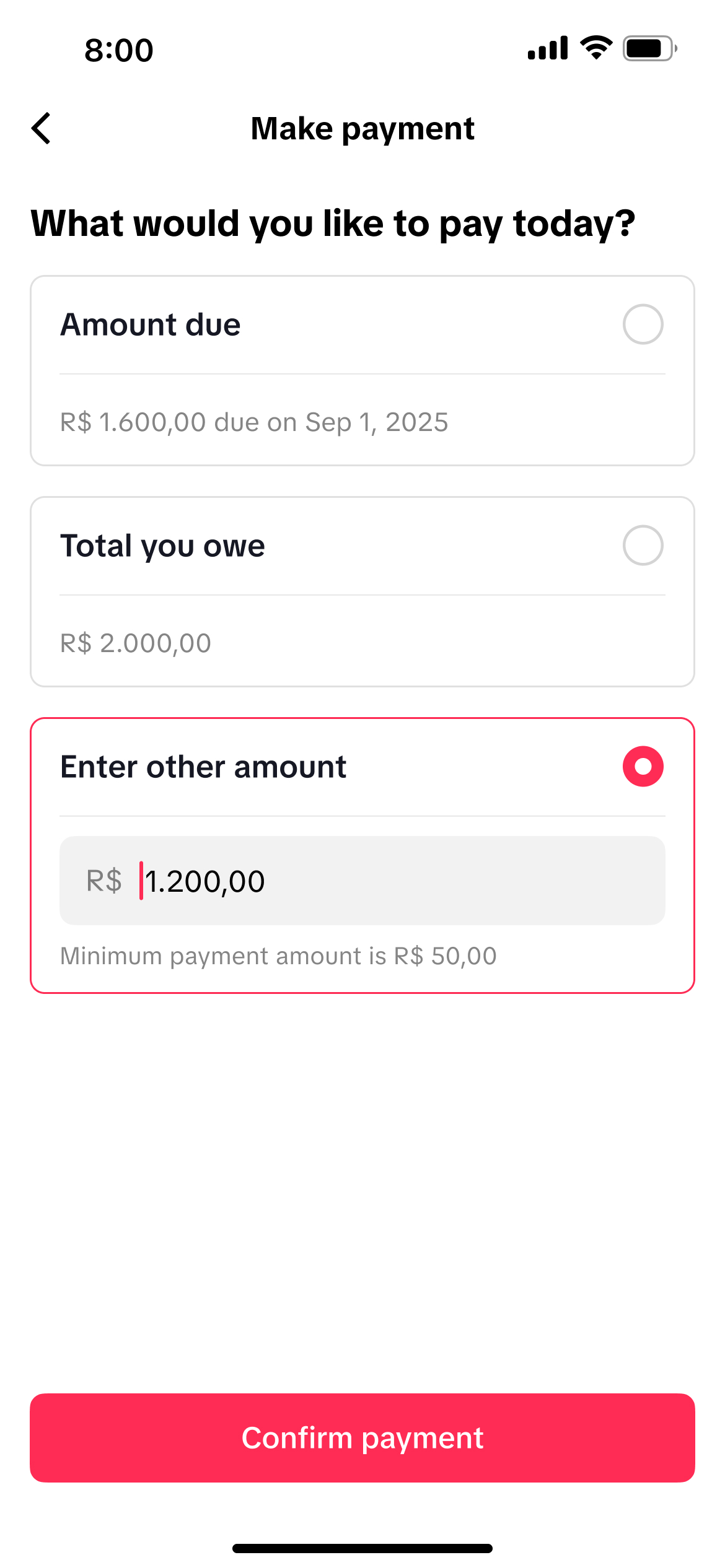
Unlike Mexico, Brazil required a more flexible flow allowing both preset selections and manual payment input. Presenting early payment discounts and applicable fees clearly across both modes added real complexity.
Solution Built a hybrid payment flow with dynamic summaries that adapt to the selected mode — keeping the experience transparent and intuitive across both preset and custom payment paths.
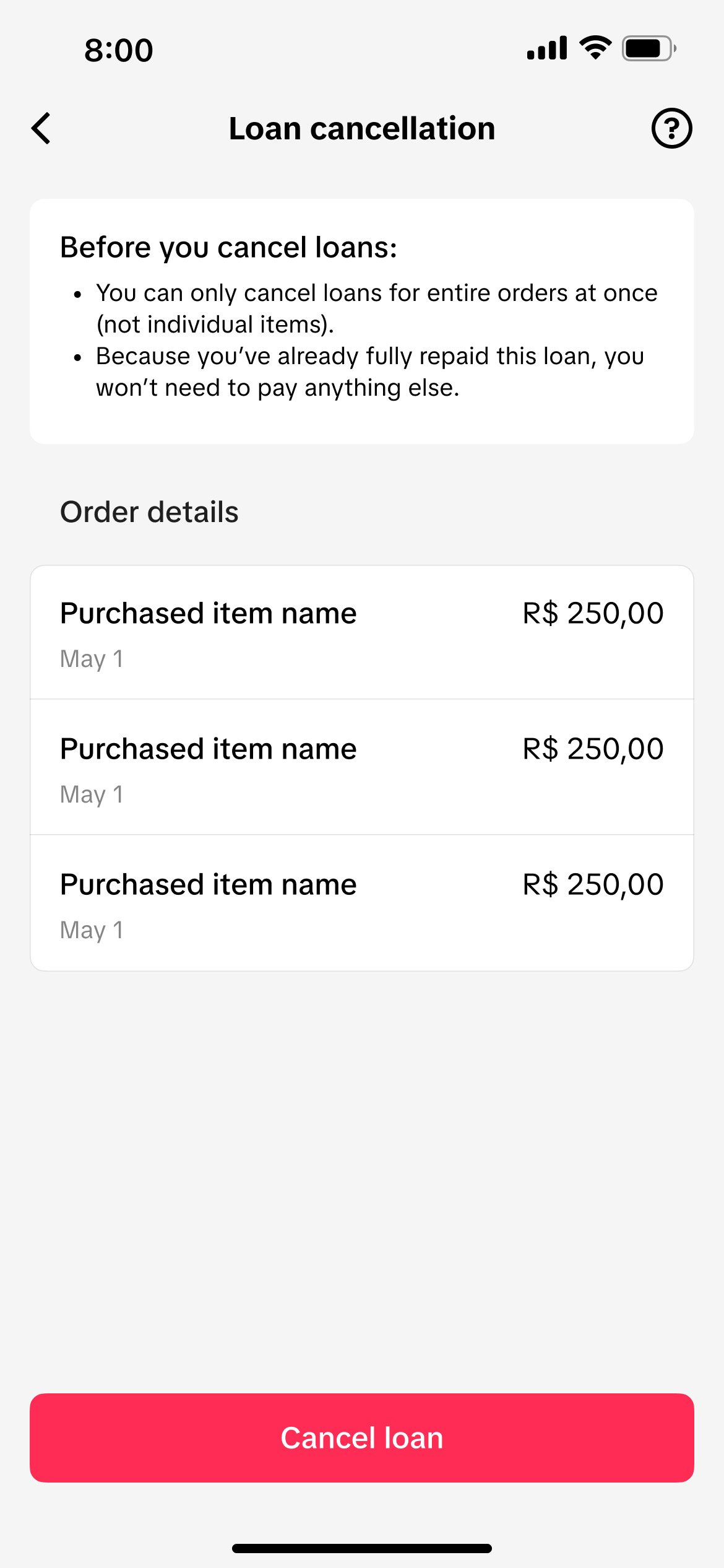
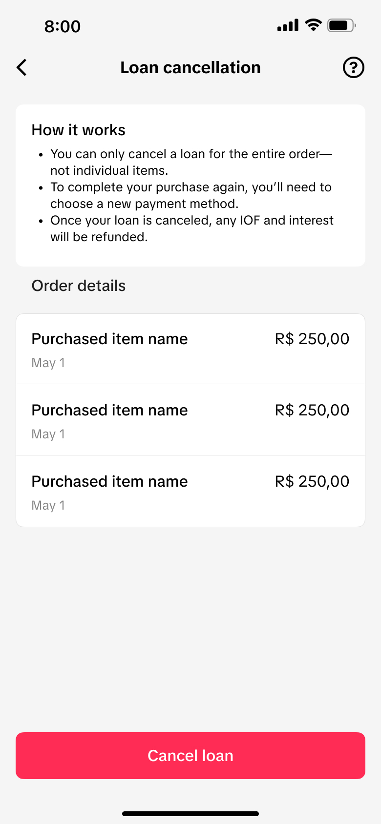
A completely new feature with no precedent in other markets. I had to identify clear entry points, guide users to select an alternative payment method after cancellation, and support edge cases like partially repaid loans and redirected payments.
Solution Designed a 0→1 cancellation flow with transparent communication of IOF tax, interest refunds, and recalculated payment summaries — so users could confidently cancel and re-route their orders without confusion.


Alongside new market launches, I designed key features that directly improved product performance and user experience across existing markets.
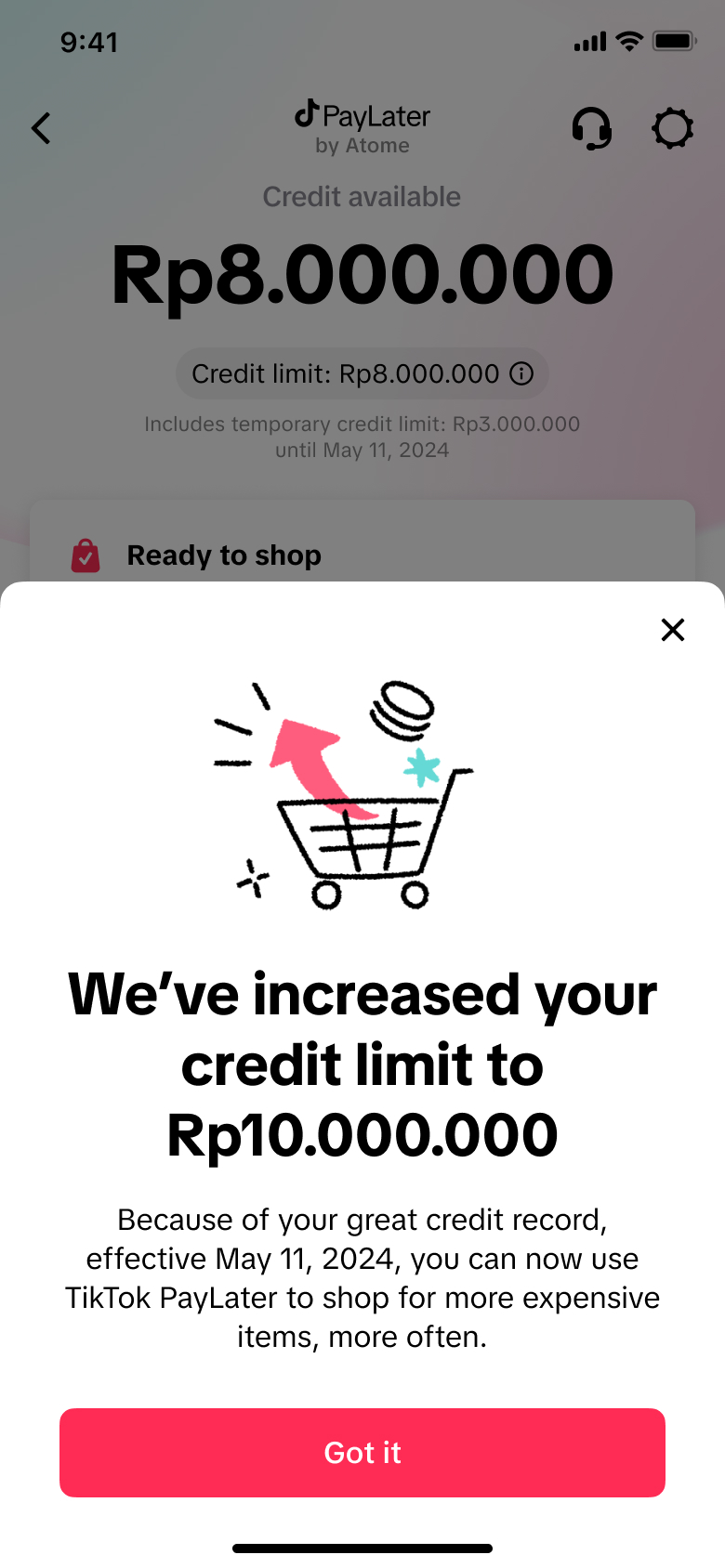
Designed a dedicated journey to inform and delight users following a credit limit increase. The feature drove a 40% uplift in usage, improved the sufficient credit rate from 70% to 80%, and increased average GMV per user by 78% across Indonesia and the Philippines.
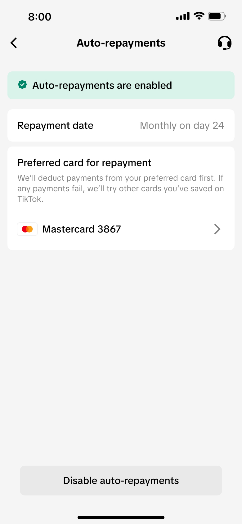
Designed a 0-to-1 auto-repayment feature that reduced manual repayment friction and improved reliability. Achieved strong early adoption with over 5,000 active agreements, establishing a foundation for the BNPL repayment experience.
Two years of designing financial products across cultures and regulatory frameworks reshaped how I think about design, trust, and global product work.
In fast-moving environments, clear design visualization becomes a shared language that drives stakeholder consensus and moves projects forward with confidence.
Effective fintech design meets users where they are first. Competitive parity builds trust; innovation is then layered meaningfully to differentiate the product.
In lending and payments, transparency around fees and repayment isn't a constraint — it's a core design responsibility that earns lasting user trust.